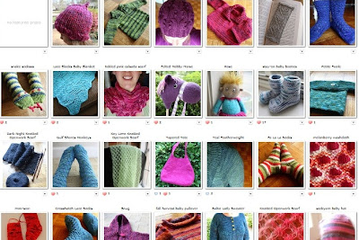
Color is one of my favorite topics ... color is what attracts me to all the crafts I dabble in. I'm happy with the simplest of patterns as long as the color makes me happy! I thought about doing another infographic to see the patterns in my color choices, but instead I tried one of those free palette generators. First, I took a screen shot of my Ravelry projects page (with the screen size zoomed out to 50% to fit almost everything in!). Here is that image, broken into two parts:
Then I dumped the image into Microsoft Paint and saved it as a .jpg. Next step? Upload the image into a palette generator! I used Palettefx.com, and it generated this palette from my Ravelry Projects page:
Pretty accurate, huh? At first I was surprised, because I feel like I choose brighter and bolder colors than this palette would suggest. More hot pinks, for example. But when I took a closer look at my projects page I realized my impression of my color choices was wrong. Now, the blues in the palette were not surprising at all. What was interesting to me is that I hadn't realized that I've used such a full range of shades/value among my blue projects. What I should do is take a picture of my stash and run another palette generator ...


13 comments:
Wow that is really interesting! I'm surprised too... That purse on your photo looks pretty bright.
I do love your palette! Both the colours and your methodology :-)
I would love to see the stash generated into a colour graphic! Just shows us that what we think things are and look like is nothing but a hint of reality.
Ah, but then you'd have to face the stash! :)
I do like this palette generator concept - very nicely done.
Exactly! Thanks. :)
Wow, now I totally want to do this! Brilliant!
What a clever idea. Thanks for introducing me to the palette generator--I've never heard of this type of app before.
I know, kind of crazy, huh?
How fun! Love the palette thing.
Also, I linked back to this post in my Inspiration Saturday feature.
http://woolendiversions.blogspot.com/2013/04/is-20-inspiration-you-guys.html
That is the neatest thing! I think mine is slightly influenced by pics taken against my neon green blocking tiles ; )
totally cool! :)
What a great idea! I was just looking through my Projects page on Ravelry and thinking, "Wow, that's a lot of blue..."
Post a Comment